Mastering Chatbot User Interface Design
Explore expert chatbot user interface design tips to build intuitive, engaging AI conversations that improve user experience and deliver real results.

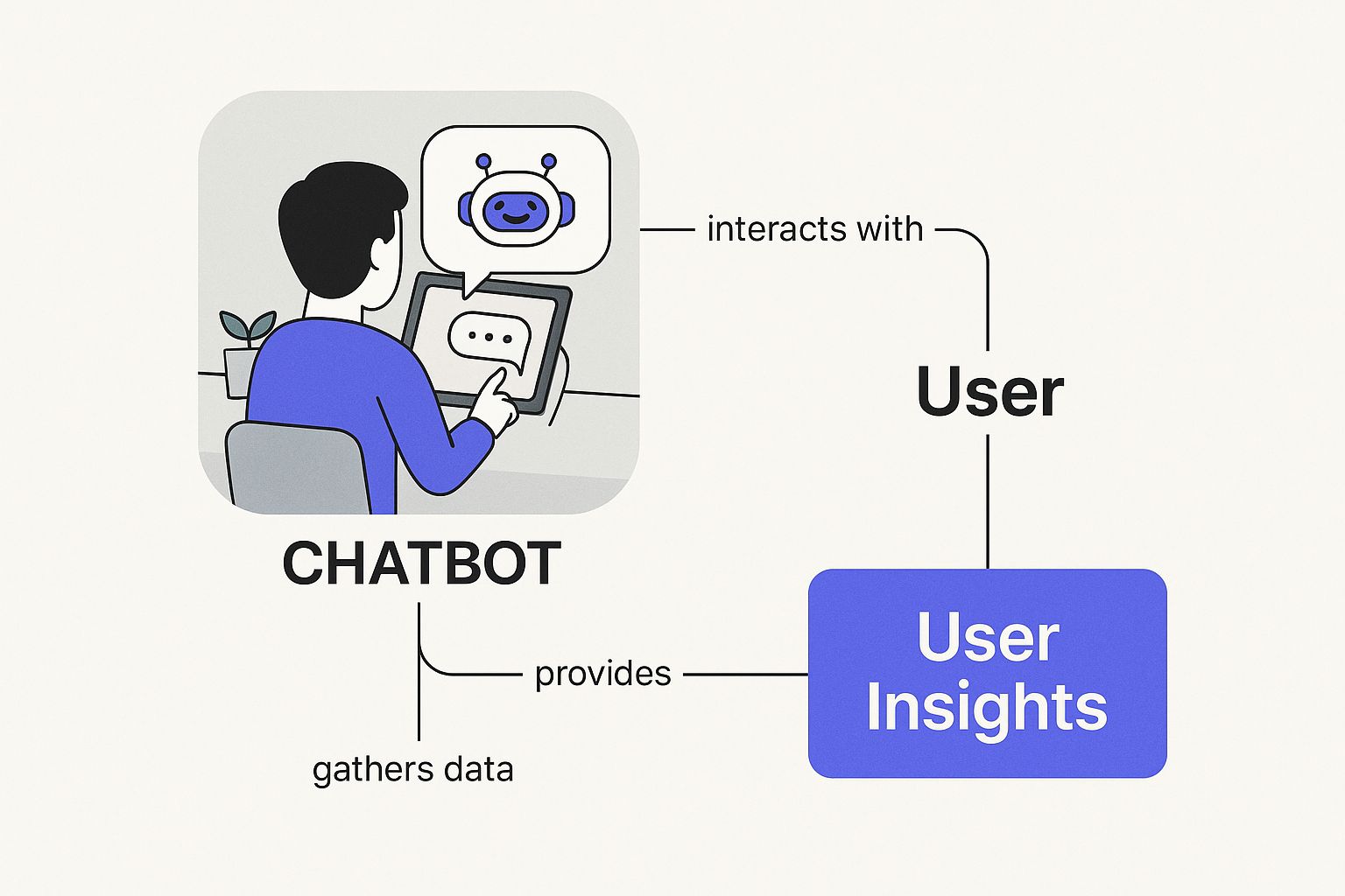
A great chatbot user interface is the difference between a helpful brand ambassador and a frustrating digital dead-end. It’s the visual and interactive layer that decides whether someone trusts, adopts, or abandons your chatbot from the very first click.
Why Great Chatbot UI Design Is a Game-Changer
Imagine hiring a world-class expert to help your customers. This person is brilliant and holds the answer to every possible question. There’s just one problem: they’re confusing, speak in riddles, and are impossible to follow.
All that incredible knowledge goes to waste because no one can actually communicate with them. A powerful chatbot with a clunky user interface creates the exact same problem.
The AI humming beneath the surface can be incredibly sophisticated, but the UI is what your customers see and touch. It’s their first impression and their only way to interact. A clean, intuitive design makes the conversation feel natural, guiding users to answers and building their confidence in your brand. On the other hand, a confusing interface just creates friction, leading to drop-offs and a sour taste.
Before we explore this further, here's a quick look at the core principles we'll be covering. Think of this as your cheat sheet for building a chatbot that people actually want to talk to.
Foundational Principles of Chatbot UI Design
These principles are the bedrock of any successful chatbot. Nailing them makes the user's journey smooth, predictable, and genuinely helpful from start to finish.
The Business Impact of a Strong Interface
Companies are pouring money into chatbot technology for a good reason. The global chatbot market is on track to hit an incredible $46.64 billion by 2029. This boom is driven by huge returns, with businesses saving up to $11 billion and nearly 2.5 billion work hours annually through automation.
But those impressive numbers hinge entirely on one thing: people actually using the bot. If the interface is a pain to use, the investment in all that fancy backend tech is completely wasted.
A well-designed chatbot UI directly fuels business goals by:
- Boosting User Adoption: An easy-to-use interface encourages people to interact with the bot instead of immediately hunting for a human agent.
- Building Brand Trust: A professional and polished UI is a reflection of your brand, signaling that you’re competent and reliable.
- Improving Conversion Rates: By smoothly guiding users through a purchase or a booking, a great UI can have a direct impact on your bottom line.
A chatbot is one of your primary digital brand ambassadors. Its interface is the handshake, the smile, and the first few words of a new relationship with a customer. Getting it right is non-negotiable.
More Than Just Looks
Effective chatbot UI design goes beyond aesthetics. It is really about building a logical and predictable path for the conversation to follow. This means strategically combining visual elements, from the welcome message that sets the tone to the quick-reply buttons that stop users from hitting a dead end.
The goal is to make the user's journey as simple as possible. For instance, instead of forcing someone to type out a common request, a well-placed button can get the job done in a single click. This thoughtful approach minimizes effort and turns the bot into a tool that’s genuinely useful.
When you put the user's experience at the center of your design, you unlock your chatbot's true potential. From there, you can explore the power of personalized chatbots to drive engagement and achieve even better business outcomes.
The Core Components of a Conversational Interface
A conversational interface is really just a collection of different parts working together. Think of it like a well-organized toolbox where every tool has a specific job. If you know these fundamental building blocks, you're on your way to creating a chatbot user interface design that actually guides users, instead of leaving them stuck and confused.
It all starts with the welcome message. This is much more than a simple "hello." It sets the tone for the entire interaction and immediately tells the user what the bot is capable of. A strong welcome message manages expectations from the get-go, stopping people from asking questions your bot was never built to answer.
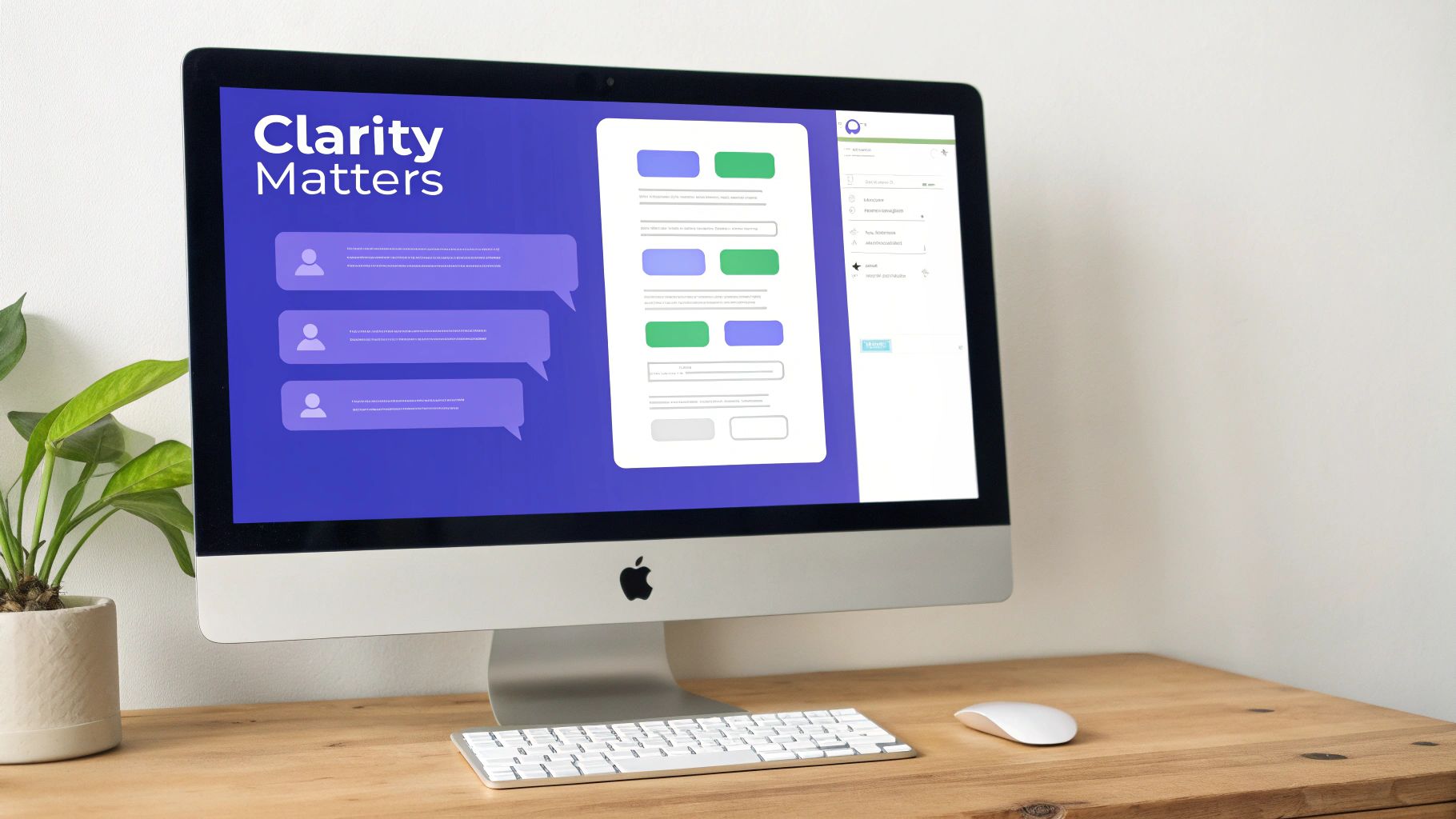
That first greeting is also a great spot to use a visual that captures user attention and gives them a quick overview, just like a well-designed dashboard.
The image above is a perfect example of how text, visuals, and interactive elements can create a cohesive experience on a single screen. After that initial hello, the interface needs other components to keep the dialogue flowing smoothly.
Guiding the Conversation with Interactive Elements
Once the chat is rolling, you need tools that make it dead simple for users to respond. Just giving them a text field and expecting them to type everything out is a recipe for frustration and typos. This is where interactive UI elements really shine.
Buttons and Quick Replies: These are your conversation shortcuts. Instead of forcing someone to type out "Show me monthly plans," a button with that exact text does all the work. Quick replies are especially handy for steering the conversation, presenting users with a few logical next steps. This cuts down on typing and dramatically reduces the chance of the bot misinterpreting what someone writes. While 88% of people have used a chatbot, they still need a clear path forward to have a good experience.
Carousels: When you need to show off multiple items like products, articles, or different service options, a carousel is an elegant solution. It presents information in a clean, swipeable format that doesn't overwhelm the chat window. Each card in a carousel can feature its own image, description, and call-to-action buttons, making it a seriously powerful tool for e-commerce and lead generation.
A well-designed chatbot UI anticipates what the user needs. By offering clear options like buttons and carousels, you shift the conversation from a guessing game to a guided journey. That’s a core principle of effective design.
Collecting Information with Forms and Fields
Sometimes, a quick button tap isn't enough. You need more detailed information from a user, and that's where input fields and forms come in. Instead of asking for a name, then an email, then a support issue one by one, a compact form can gather it all at once.
The design here is important, though. Keep your forms short and sweet, and only ask for what's absolutely necessary. If you have a longer process, break the form up into a few steps so you don't overwhelm the user. When you integrate these elements right into the chat, it feels less like filling out a boring document and more like part of the conversation.
If you want to go deeper on this, our guide on foundational chatbot design principles offers more strategies for building user-friendly interactions.
The Supporting Cast of a Great UI
Beyond the main interactive elements, a few smaller components add a layer of polish that makes the whole experience feel more professional and human.
Avatar and Name: Giving your chatbot a name and a face helps to personify the interaction, making it feel more like a real conversation. This should align perfectly with your brand's personality, whether that's friendly and casual or formal and straight-to-the-point.
Typing Indicators: You know that little animation that shows the bot is "typing"? It's a simple but incredibly effective piece of feedback. It lets the user know their message was received and a response is on the way, getting rid of that awkward silence that makes people wonder if the bot just broke.
Chat History: This is a basic expectation. Letting users scroll back through the conversation helps them remember context and review information they've already been given. It’s a standard feature in any messaging app, and users will definitely expect it in your chatbot, too.
By thoughtfully combining all these core components, you create an interface that feels intuitive, efficient, and genuinely helpful. Every single element has a role to play in managing the flow of the conversation, preventing dead ends, and ultimately guiding the user to a successful outcome.
Matching Your UI to the Conversation Type
Not all conversations are created equal, and neither are chatbots. A huge part of getting chatbot user interface design right is realizing that the UI has to perfectly match the bot’s actual job. Trying to force one design on every chatbot is like trying to use a hammer for everything in your toolbox because sometimes you really just need a screwdriver.
The secret is to first know the kind of conversation the user needs to have. Think about the difference between a choose-your-own-adventure book and an open-ended chat with an expert. The book gives you a limited, clear set of choices on each page, guiding you down a specific path. The expert chat, on the other hand, is flexible and can branch off in countless directions based on whatever you ask.
These two scenarios are a great way to think about the two main types of chatbots: structured (rule-based) and unstructured (AI-driven). Each one needs a totally different UI strategy to work well.
Designing for Structured, Rule-Based Chatbots
Structured chatbots are the choose-your-own-adventure books of the bot world. They're built for specific, predictable tasks like booking an appointment, checking an order status, or walking a user through a predefined list of FAQs. They follow a strict set of rules and aren’t designed to figure out complex, free-form text.
For these bots, the UI design has to be all about clarity and guidance. The goal is to steer the user through a workflow with absolutely zero confusion.
A structured chatbot’s UI should feel like a guided tour, not an open field. The user should always know exactly what to do next, with every option laid out for them.
The best UI for a structured bot is loaded with interactive elements that limit what the user can input, which helps prevent errors before they happen.
- Buttons and Quick Replies: These are your most valuable tools. Instead of a vague "How can I help you?", you present buttons like "Track My Order," "Check a Price," or "Schedule a Demo." This immediately funnels the user down a path you’ve already built.
- Menus: For bots that juggle several distinct functions, a persistent menu gives people a reliable home base to return to if they get lost or want to tackle a different task.
- Carousels and Cards: When you need to show off a set of options like different product types or available appointment slots, carousels display that info cleanly without cluttering up the chat window.
The entire design philosophy here is about constraint. By limiting how a user can respond, you make the conversation incredibly efficient and all but eliminate those frustrating "Sorry, I don't understand" dead ends that plague poorly designed bots. It’s no surprise that many of the most effective lead generation chatbots lean heavily on this structured approach to guide prospects through qualifying questions.
Crafting a UI for Unstructured, AI-Driven Chatbots
Now, let's talk about the other side of the coin. Unstructured, AI-powered chatbots are the experts you can have an open-ended discussion with. They use natural language processing (NLP) to understand and respond to a huge variety of user questions, much like a real person would. These are the bots you want for complex customer support, in-depth research, or any situation where the user’s needs aren't easy to predict.
Designing a user interface for an AI bot is less about constraint and more about managing expectations and ambiguity. Here, the text input field is the main event, but it needs a strong supporting cast to succeed.
Your design has to account for the fact that users can, and will, type just about anything.
- Clear Onboarding: The very first message should give the user a solid idea of what the bot can actually do. A simple opener like, "I can help you with X, Y, and Z," goes a long way in setting realistic expectations.
- Helpful Prompts: Don't just greet the user with a blinking cursor. Give them a nudge in the right direction with example questions or suggestions. Something like, "You can ask me things like 'What's your refund policy?' or 'Compare product A and B.'" This teaches people how to interact with the bot effectively.
- Graceful Error Handling: When the bot inevitably gets confused, the UI needs to handle it well. Instead of a blunt "I don't know," the response should guide the user back on track. For example: "I'm not quite sure I follow. Are you asking about billing, shipping, or something else?" This uses buttons to get the conversation back on solid ground.
- Human Handoff: There must always be an obvious, easy way for a user to connect with a human agent. A "Talk to a person" button that’s easy to find is non-negotiable for AI bots handling sensitive or complicated issues.
The UI for an AI bot should feel like a smart, helpful conversation partner that is highly capable but also knows its own limits. It's a delicate dance between giving users freedom and providing a safety net to catch them when the conversation goes off-script.
Bringing Your Chatbot to Life with Visuals and Personality
A chatbot that just works is fine. But a chatbot with personality? That’s what creates a memorable connection. The chatbot user interface design is about so much more than usability; it’s your chance to give the bot a character that actually reflects your brand.
Think of your chatbot as a digital employee. You’d expect a human team member to communicate in a way that matches your brand’s style, right? Your bot's visuals and tone should do the same. This consistency builds trust and makes the whole interaction feel cohesive. A bot for a bank should feel secure and formal, while one for a gaming company can be fun and energetic.
Crafting a Believable Persona
First things first: you need to define your bot's persona. Is it a witty assistant? A straightforward professional? A friendly guide? This decision should directly mirror your brand’s voice. A bot with a well-defined personality feels less like a cold piece of software and more like a helpful partner in the conversation.
This persona goes beyond the words it uses. Every single UI component should support its character. For example, a professional bot might use a clean, minimalist design with a standard font. A more casual bot could lean into playful emojis and a brighter color palette. The goal is to create a unified experience where the look and the language work together perfectly.
A chatbot’s personality isn't just a cosmetic feature. It's a strategic design choice that influences how users perceive your brand and how engaged they become with the conversation.
Using Visuals to Communicate and Reassure
Visual elements are your best friends when it comes to expressing this personality and, just as importantly, improving the user experience. Small visual cues can make an interaction feel much more human and responsive, cutting through the awkwardness that sometimes comes with automated chats.
A few key visual signals make a huge difference:
- Avatars: Giving your bot a face, even a simple icon, makes it feel more tangible. The avatar should visually represent the bot's intended personality. A simple geometric shape might feel modern and efficient, while a cartoon character could feel more approachable.
- Typing Indicators: That little "..." animation showing the bot is "typing" is incredibly powerful. It manages user expectations and reassures them that their message was received and a response is on its way. It's a simple trick that prevents people from feeling ignored.
- Read Receipts: Just like typing indicators, those little checkmarks confirm that a message has been seen. This kind of simple feedback is a standard feature in modern messaging apps, and users have come to expect it.
These subtle details help the exchange feel more like a real-time conversation, which is key to keeping users engaged.
Aligning UI Elements with Bot Personality
The specific UI elements you choose can dramatically alter how users perceive your bot's character. Everything from the shape of the buttons to the style of the chat bubbles contributes to the overall tone.
A chatbot's look and feel should be intentional, not an afterthought. Making deliberate choices about colors, fonts, and even the shape of a button can help you build a bot that truly represents your brand.
The table below shows how you can tailor UI elements to create two very different chatbot personalities, so your bot's visuals align with its intended voice.
UI Element Choices for Different Bot Personalities
By making conscious decisions about these visual components, you can effectively build a chatbot that not only works well but also acts as a powerful extension of your brand identity. It's these small, thoughtful details that turn a good bot into a great one.
Building a Smooth and Logical User Journey
A great chatbot interaction feels like a well-paved road. It’s smooth, clearly marked, and gets you to your destination without confusing detours or frustrating dead ends. The heart of effective chatbot user interface design is mapping out this journey before you even think about picking a color palette.
This means thinking through every possible turn the conversation might take. By charting these conversational flows, you can anticipate what users need, spot potential roadblocks, and design a path that feels natural from the first "hello" to the final "thanks!" It’s a proactive approach that puts the user’s experience front and center.
Setting the Stage with Clear Onboarding
The user's journey starts the second the chat window pops open. This first interaction, or onboarding, is your single best shot at setting clear expectations. A vague "How can I help?" is a recipe for disaster because it invites users to ask about anything under the sun, leading to quick failure if your bot has a specific job.
Instead, a strong onboarding message gets straight to the point. It might say, "Hi! I can help you track an order, check product availability, or answer questions about our return policy." This simple statement immediately frames the conversation and guides the user to things the bot can actually do.
Getting this right is important. Recent data shows that 87.2% of consumers report neutral or positive experiences with chatbots. But the same research reveals that 38% of users get frustrated when a bot fails to understand them, a clear sign of a poorly designed journey. With 69% of people satisfied with their last bot interaction, it's clear that starting the journey off on the right foot pays off.
Handling Errors and Getting Back on Track
No matter how perfectly you map the journey, users will eventually take an unexpected turn. They might ask a question your bot isn’t built for or make a simple typo. How your chatbot UI handles these moments is what separates a helpful tool from a digital dead end.
Good error handling isn't just about saying, "I don't understand." It's about gracefully guiding the user back to a productive path. These guiding messages are often called fallback responses.
A good fallback response is a gentle course correction, not a full stop. It should acknowledge the confusion and immediately present clear, actionable options to get the conversation moving again.
For instance, instead of a generic error, a much better response would be: "I'm not quite sure I follow. Are you trying to:
- Track an existing order?
- Ask about a product?
- Connect with a support agent?"
This approach turns a moment of potential frustration into a helpful navigational tool. It uses UI elements like buttons to keep the user from getting stuck, making the experience feel supportive even when there’s a hiccup.
Finding Friction with User Testing
You can map out what you believe is the perfect conversational flow, but you won’t know for sure until real people try it out. User testing is an absolutely vital part of refining the user journey and creating a seamless chatbot user interface design. It’s where you uncover all the hidden friction points, like confusing prompts, awkward phrasing, and conversational dead ends, that you were too close to the project to see.
Watching how people interact with your bot provides priceless feedback. Do they hesitate at a certain prompt? Do they keep asking a question in a way you never anticipated? This feedback is gold. It lets you make targeted tweaks that have a real impact on the user experience. To truly get inside your users' heads and refine your bot's flow, it helps to explore essential user research methods that can give you a structured way to gather these insights.
Your Practical Chatbot UI Design Checklist
Bringing all the pieces of a great chatbot user interface design together can feel like juggling a dozen moving parts at once. To make it a whole lot easier, use this checklist as your guide. It covers everything from initial strategy to the final polish, so no important step gets missed.
1. Define Your Foundation
Before you touch a line of code or sketch a single UI element, you need a solid plan. A clear strategy here saves you from major headaches down the road. For a structured approach, knowing the design thinking process steps gives you a proven blueprint for keeping your project on track.
- Identify the Core Purpose: What's the one job this chatbot absolutely must do? Nail down its primary function, whether that’s booking appointments, answering FAQs, or qualifying leads. Get specific.
- Develop a Bot Persona: Give your bot a personality. Is it formal and professional, or casual and friendly? This persona should be a natural extension of your brand's voice and set the tone for every conversation.
- Know Your Audience: Who are you building this for? Think about their technical skills, their expectations, and what they're trying to achieve. This insight will shape every single design decision you make.
2. Design the Conversational Experience
With your foundation set, it’s time to map out the interaction itself. The goal here is a conversation that feels natural and intuitive, guiding users to a solution instead of leaving them confused.
- Map the Conversation Flow: Get out a whiteboard and sketch the entire user journey. Think through the ideal path a conversation can take, but don't forget to plan for the inevitable detours and dead ends.
- Select the Right UI Components: Choose the best tools for each step. Buttons and quick replies are perfect for guiding users down a specific path. Carousels work wonders for displaying products or options. And forms are vital for collecting information without a lot of back-and-forth.
- Plan for Errors Gracefully: What happens when your bot gets stuck? Don’t just leave the user hanging. Design helpful fallback messages that get the conversation back on track with clear, actionable options.
A well-designed chatbot doesn’t just answer questions; it anticipates user needs and provides a clear, guided path forward. This proactive approach is a hallmark of excellent UI design.
3. Polish and Test
Finally, it's time to bring the design to life with visual branding and, most importantly, real user feedback. This last phase is what makes sure your chatbot doesn't just work well but also feels like a seamless part of your brand experience.
- Apply Visual Branding: Integrate your brand’s color palette, fonts, and logo. Add a custom avatar and typing indicators to make the chatbot feel more responsive and human. These small touches make a huge difference.
- Conduct User Testing: Get real people to talk to your chatbot. Watch where they get stuck, what confuses them, and which parts they find genuinely helpful. Use this feedback to refine everything from the conversation flow to the interface itself.
Following these steps methodically will help you build a chatbot that's not only effective but also a pleasure to use. For more tips on keeping your standards high, be sure to review these valuable chatbot best practices.
Got questions about chatbot UI design? You’re not alone. As you start putting these principles into practice, a few common queries always seem to pop up.
Let's walk through them.
How Do I Make My Chatbot Sound Less Robotic?
The secret to making a chatbot feel less robotic is giving it a personality. Start by defining a clear persona that actually sounds like your brand. Is your company’s voice friendly and casual? Professional and polished? Or maybe a little witty?
Once you know the vibe you're aiming for, write its responses in a natural, conversational style. Don't be afraid to use contractions like "it's" or "you're," and stick to simple language. Little things like typing indicators and read receipts also make the interaction feel more like a real conversation, reassuring the user that the bot is on it.
What’s More Important: UI or UX in Chatbot Design?
This is a classic question, and it's easy to get the two mixed up. UI (User Interface) is what the user actually sees and interacts with, like the chat window, the buttons, and the colors. UX (User Experience) is how the user feels about the entire interaction.
UI is the car, but UX is the road trip. A beautiful interface (UI) is pointless if the conversation is clunky and confusing (UX).
They're two sides of the same coin; one can't succeed without the other. Good UI is the foundation, but your goal is an effortless experience, and that's all about UX. They have to work together.
How Much Customization Is Too Much?
Customization should always serve a purpose, not just be decoration. Getting the colors, fonts, and avatar to match your brand is a must because it creates a cohesive and trustworthy experience. But adding too many bells and whistles, like distracting animations or a cluttered layout, just gets in the way.
The best chatbot interfaces are usually clean and simple. Before you add another visual element, ask yourself a simple question: does this make the conversation clearer or easier for the user? If the answer is no, it's probably just noise.
What Is the Best Way to Handle Errors?
The key to handling errors is guidance, not just a dead-end apology. A chatbot should never just throw up its hands and say, "I don't understand." That's a surefire way to frustrate someone.
Instead, a great chatbot offers a fallback response that gets the conversation back on track. It should acknowledge the confusion, then immediately offer clear, clickable options. For example: "I'm not quite sure I follow. Were you trying to track an order, or ask about a product?" This turns a moment of failure into a helpful detour.
Ready to build a chatbot that not only answers questions but also drives real business results? The Chatiant platform makes it simple to create powerful AI agents trained on your own data. Start building your custom chatbot today!
Mike Warren
Porttitor pellentesque eu suspendisse porttitor malesuada odio tempus enim. Vitae nibh ut dui ac morbi lacus. Viverra in urna pretium hendrerit ornare enim mauris vestibulum erat.